Overview
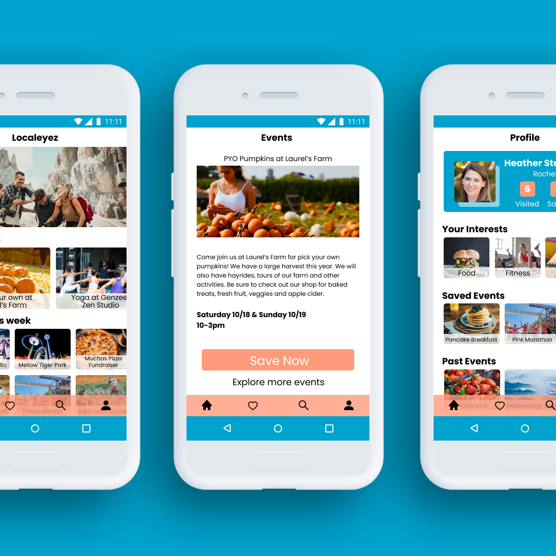
Localeyez wants to create a mobile app similar to their web app that connects users to local events in their area. Localeyez focuses on aggregating a list of activities, specific to the user’s preferences.
The Challenge
Before the creation of this mobile app, LocalEyez used web scraping and machine learning to change the UI every week to accommodate the user’s preferences. They want to explore a different direction such as a monthly membership that provides the user with access to experiences and move away from web scraping.
Localeyez Goals
To provide users with a personalized dashboard that addresses their interests when looking for events and experiences.
Allow users to find a local activity to attend.
Engages the audience by providing personalized information.
Allows users to have control over their preferences.
Makes the app more interactive and fun.
Roles & Responsibilities
I was on a team of three including Petra, our Lead Product Designer and Lionel our Product Manager. I was the Product Designer and was given the web app wireframes to use as a starting point to build the wireframes for the mobile app and develop the UI. I built the wireframes for the app and also conducted the usability testing. In addition to these responsibilities, I was tasked with developing the onboarding; my team wanted an onboarding flow similar to Meetup. Creating a remixed layout of “The Feed” for mobile and redesigning the user profile screen was my responsibility as well.
Comparative Research
I researched similar apps that successfully provide information on events and other local activities, that also use preference learning. Eventbrite, Meetup, Foursquare and Airbnb were apps I found. My goal was to research and identify what works in their apps for inspiration and to remix and apply it to Localeyez.
Meetup
Meetup has a splash screen that changes with real photos of people participating in events. The user can enable their location to find events near them, select different categories of interest and further refine those interests.
Airbnb
Airbnb has effective round buttons and a relaxing color palette and graphics. Their images are rounded similarly to their buttons. Excellent use of graphics.
Foursquare
Foursquare has an enticing plate of food in the background of their splash screen, encouraging users to join. To search they have broken up the sections by meal (breakfast, lunch, dinner), drinks, nightlife and things to do and have included simple visuals, organized logically. The user can easily search near them and there are suggestions as well.
Eventbrite
Eventbrite has a highly effective search screen that allows the user to fill in the blanks of when they want to go out, what type of event and what they are in the mood for. Very intuitive.
Users & Audience
Gender: Female
Age: 22-40 years old
Annual Income: $40,000-80,0000
Location: Large Urban Areas, United States (initial marketing and focus is New York City)
Interests: Cooking, Exercise, Wellness and Health
Attitudes: Health Conscious, Joiner, Basic, Intimidated by Cooking, Optimistic, Ambitious, Wants to Eat Out Less, Wants to be ‘Healthier”
Challenges: Lack of Time and Resources, Lack of Skill, Social Isolation via Urban Culture
Personas provided by Localeyez.
Scope & Constraints
Localeyez requested this project be complete within 5 days.
Website Wireframes
I was provided the wireframes for the Localeyez web app as a starting point.
Sitemap
Upon reviewing the web app wireframes and what additions and remixes they wanted for the mobile app, I created a site map to show all of the initial screens I would need to create.
Wireframes
Based on the website wireframes provided, the screens needed that were determined while creating the site map and the requests from Localeyez, these are the first wireframes I created as a Product Designer.
Moodboard
Provided by Localeyez.
Color Palette
They gave me the leeway to create a new color palette for the app. I pulled these colors from the moodboard that they provided and worked with them to ensure there were not contrast or accessibility issues. I created mood adjectives as well as I studied the moodboard to ensure the colors chosen would give those feelings to the users. Orange generates excitement and spontaneity and blue creates a feeling of peace, calmness and reassurance in the user that we will have all of the information they need to find their events.
Typography
I was given the opportunity to use new typography for the name and content and create a logo as well.
Poppins was chosen as the font because of its readability at sizes as low as 11pt, roundness of letters which can be soothing to users. This font was also chosen because it has the option to be in bold with no readability issues. The goal is for the users to find the information they want about events without the font type getting in the way.
Logo Development
The logo was created with two mirroring E’s to look like an eye, happy face and a bright horizon, representing future events. This logo was created to draw visual attention to the first onboarding screen, portray to the users that this app will lead to happiness in finding fun events, ease of process and is harmonious with the name, Localeyez.
Interface Inventory
Interface inventory. In this inventory, I provided every aspect that is contained in the app at this stage to simplify further iterations and development of screen additions.
High Fidelity Prototype
The colors are used consistently; the background is white, the blue and orange are used in the navigation, buttons, graphics and color blocks. Black and white are used for text and occasionally blue and orange are used. I utilized these colors because they were in the mood board and they capture the feelings we are attempting to evoke in the users when they access the Localeyez app. The buttons are consistent as well; slightly rounded rectangles in blue, orange and in one instance outlined in white so they are easily identifiable and in conspicuous locations. The first screen has two backgrounds to show the diversity of interests in our users. There is some animation provided in the onboarding to make it playful, fun and to entice the user to join Localeyez. The logo is used playfully to show this app is enjoyable to use and helps makes the onboarding process smooth. Each screen beyond this provides the user with many colorful images neatly organized and labeled with category titles and titles on each tile so the user can easily find the event they are looking for. The profile screen as well gives them a visually appealing personal section where they keep their saved events, past events and shows them their current interests. The flow of the screens is intuitive and walks them through finding what they are looking for and suggests events based on their interests.
Usability Testing
I found 6 participants to test the navigational flow of the Localeyez app and to inform us of how the app makes them feel. They were given a set of specific instructions to navigate the app. It was set up in a heatmap format so we could identify where they were clicking, even if it wasn’t in the correct area. We found that when they made it to the select interests, step four, during the onboarding flow, they attempted to follow the directions within the app, not the written instructions. They were tapping on the selections, not the next button which was specified. It shows that the directions on the app itself were clear, requesting the user select at least two interests, but they did not select the next button. It showed us that the next button needs to be reiterated to make it more clear visually to the user. This particular test was used because it was critical to find out if the user could easily navigate to access all of the content. None of the 6 participants went past step four.
We asked the users how the app makes them feel and to describe what they think it.
Convenient.
Easy to use and understand.
Well presented, organized.
Home screen is easy to understand.
Seems pretty user friendly.
This app makes the user feel happy and they would like to have an app like this when they travel.
Likes colors used.
Easy to use and understand.
Well presented, organized.
Home screen is easy to understand.
Seems pretty user friendly.
This app makes the user feel happy and they would like to have an app like this when they travel.
Likes colors used.
One user said it looks interesting, but they thought it was possibly a dating app.
One user said they had trouble getting through all of the clicks in the navigation process, but they like the look of the app.
One user said they had trouble getting through all of the clicks in the navigation process, but they like the look of the app.
Results and Goals Achieved
This research reveals that most users think the app is easy to use and understand, it is organized and the colors are appealing.
One user thought it might be a dating app possibly because of the couple picture on the first onboarding screen. This picture could be replaced or more circulating images can be added. Right now for there is the couple at an event and people at a marathon shown in the background of the first onboarding screen.
The second issue of not being able to click through all of the screens could be due to the next button not being highly visual which was revealed during the navigation test.
The usability testing results and feedback shows that the app is successful in providing the user information on events. I sought to complete all tasks asked of me as the Product Designer for Localeyez. There are only minor iterations at this point based on the feedback and additional screens to be added to make it fully functional.
Learning Points
I learned that I have the skills as a Product Designer to create an event app and can handle the workload involved. The usability testing and brief survey showed me the power of research during a project and how it can be used to identify any issues and show what is working well.
Also spending a great deal of time researching apps that are similar and successful with what I was trying to accomplish helped me tremendously. I was able to use pieces of those apps as inspiration.
